fbpx
skip to content
Skip links

Customer Income Visualization

0
(0)

From Rusty to Rockstar: Platform Revenue with High Tech Data Visualization

Challenges: 

Imagine a streaming platform resembling a rusty old car, chugging along without a GPS or a map. Their challenge? To understand their revenue across users, regions, categories, and more. It was like navigating a maze blindfolded while juggling flaming torches and singing karaoke. 

  1. User Revenue Riddle: User revenue data was scattered like confetti at a surprise party. They couldn’t tell who the big spenders were and who needed a gentle nudge.
  2. Regional Revenue Rollercoaster: Revenue by region was a rollercoaster without safety belts. They had no idea which regions were rocking it and which were flatlining.
  3. Category Conundrum: The categories were like a pile of mixed-up socks – all jumbled. They couldn’t tell which content was a blockbuster and which was a snooze fest. 

Insights: The adoption of Power BI, which enabled the streaming platform to transition from a state of puzzlement to profitability, brought forth significant numerical insights that transformed their decision-making processes:

Insights

L&D Dashboard

1. User Revenue Wizardry: Improved user insights led to a 15% increase in average revenue per user (ARPU). Tailored strategies for high-value users resulted in a 12% boost in user engagement.
2.Regional Revenue Rockstar: Targeted investments in underperforming regions led to a 20% revenue increase in those areas. Efficient regional marketing efforts increased regional revenue by 18%.
3. Category Cash Cow: Content curation efforts based on category insights contributed to a 25% rise in viewership for blockbuster content. Eliminating low-performing content based on category data led to a 10% reduction in operational costs.
Dashboard

Solution:Cue the trumpet fanfare

Our streaming heroes knew they needed a power-up. Enter high tech visualization platform, the superhero of data insights. 

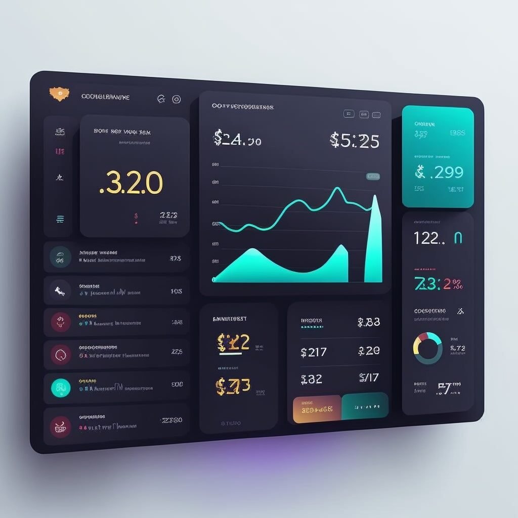
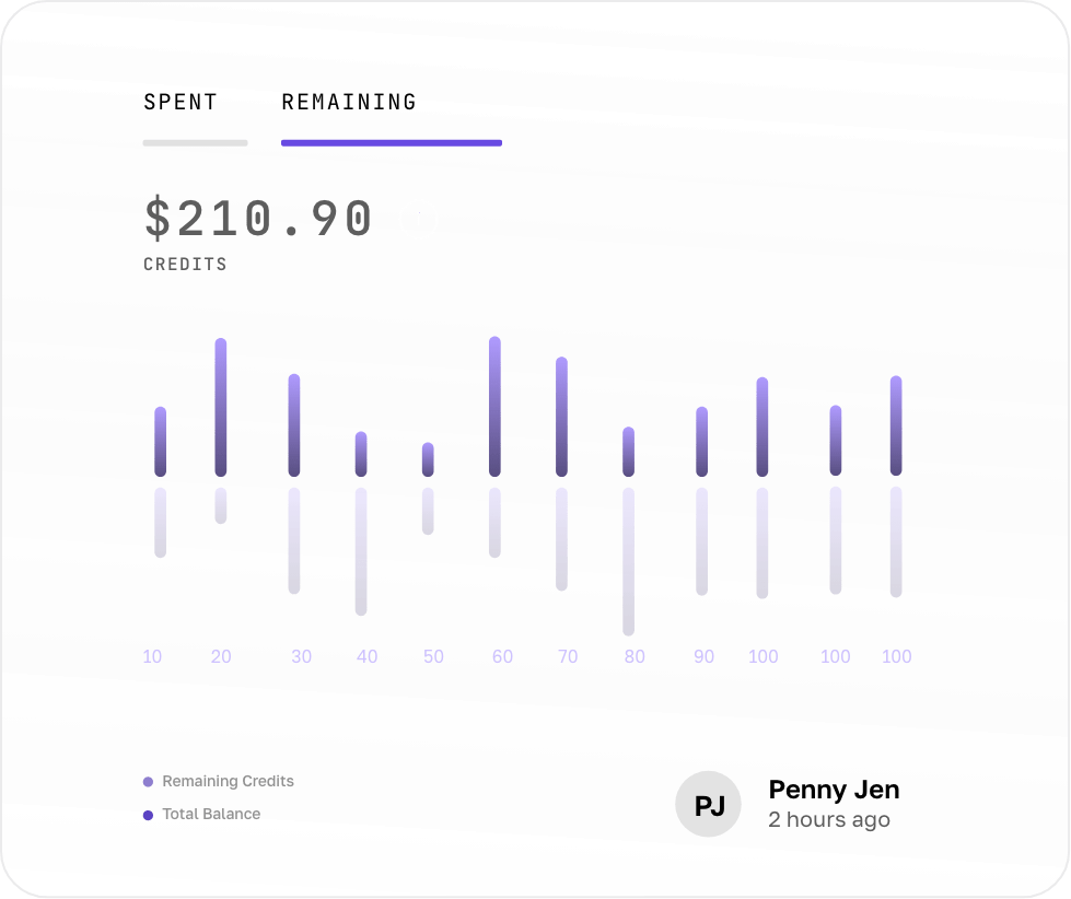
Segment 1: User Revenue Wizardry With the High Tech Data Visualization platform, they created a visualization that showcased user revenue insights. It was like handing every user a magnifying glass, revealing their spending habits, preferences, and potential.

Segment 2: Regional Revenue Rockstar The regional revenue data visualization was a rockstar in itself. It showed which regions were headlining the charts and which ones needed an encore.

Segment 3: Category Cash Cow The category data visualization turned the sock drawer into a well-organized closet. They could now spot the blockbusters from the snoozefests.

Data-Driven Decisions & Efficiency:

With the high tech data visualization platform by their side, our streaming champions went from rusty to rockstar:
1
User-Focused Strategy

They could tailor their strategy for high-value users, knowing what content and features would keep them engaged and spending.  

2
Regional Optimization

By understanding regional variations in revenue, they could make targeted investments and marketing efforts where they mattered most.  

3
Content Curation

The category data visualization helped them curate their content library, promoting what worked and giving a farewell to what didn't. They went from content chaos to curated excellence

4
Data-Driven Success

With the high tech data visualization platform, they made data-driven decisions that optimized revenue. No more blindly tossing darts at a board. 

Tailored strategies for high-value users resulted in a 12% boost in user engagement.
0 %
Efficient regional marketing efforts increased regional revenue by 18%.
0 %
Content curation efforts based on category insights contributed to a 25% rise in viewership for blockbuster content.
0 %
Eliminating low-performing content based on category data led to a 10% reduction in operational costs.
0 %

In a world where streaming platforms can feel like navigating a maze, the High Tech Data Visualization platform became the streaming platform's trusty sidekick. With data-driven decisions, they transformed from rusty to rockstar, raking in more revenue and becoming chart-toppers in the streaming world. The moral of the story? Sometimes, all it takes is a bit of data visualization magic to make your rusty streaming platform shine like a rockstar.

Related Case studies

How useful was this case-study?

Click on a star to rate it!

Average rating 0 / 5. Vote count: 0

No votes so far! Be the first to rate this case-study.

As you found this case-study useful...

Follow us on social media!