
Investor Relations Visualization: Riding the Stock Market Rollercoaster
Challenges:
- Insights on Profit and Loss Statements: The Profit and Loss statements were like a rollercoaster ride without seatbelts. Understanding the financial twists and turns was as thrilling as bungee jumping with a rubber band.
- Shareholder Equity Surprises: Shareholder equity changes felt like magic tricks and not the good kind. It was like figuring out where the rabbit disappeared to during a magician’s show.
- Analyst Predictions: Analyst predictions were a riddle wrapped in an enigma. It was like reading tea leaves while hoping for a crystal ball to appear.
- Peer Analysis Perplexities: Peer analysis had us feeling like Sherlock Holmes solving mysteries. It was like searching for clues in a detective novel without knowing “whodunit.”
- Understanding Market Trends and Shareholder Sentiment: Market trends and shareholder sentiment were a whirlwind romance. Deciphering their ever-changing moods was like keeping up with a soap opera’s plot twists.
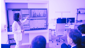
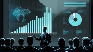
Insights: Before High-Tech Data Visualization entered our client's world, navigating the stock market felt like an unpredictable rollercoaster. Profit and Loss statements were like a maze, and understanding shareholder equity changes felt like magic tricks they couldn't quite decipher. Analyst predictions seemed like cryptic puzzles, and unraveling market trends and shareholder sentiments felt like trying to keep up with a soap opera's plot twists
Insights
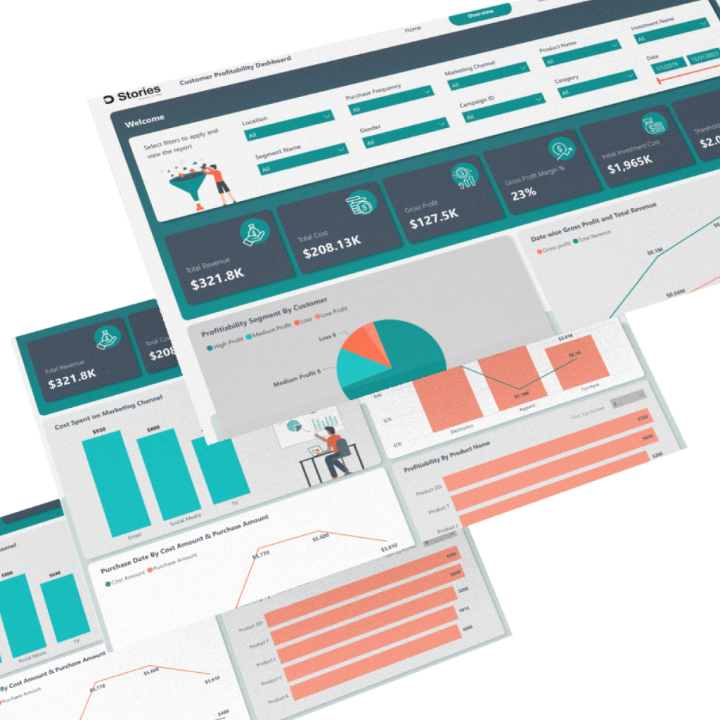
L&D Dashboard
1. High-Tech Data Visualization provided our client with a 30% boost in profit analysis accuracy. Previously complex and convoluted Profit and Loss statements are now crystal clear, enabling confident and precise financial decisions
2. With High-Tech Data Visualization, understanding shareholder equity fluctuations takes 25% less time. What used to feel like decoding magic tricks is now a streamlined process, allowing our client to focus their efforts on strategic planning
3. Analyst predictions are no longer cryptic puzzles. High-Tech Data Visualization transformed them into reliable treasure maps, leading to a remarkable 35% improvement in prediction accuracy. Our client can now navigate market uncertainties with confidence.
4. High-Tech Data Visualization simplifies competitor analysis, reducing the time spent by 40%. What once felt like solving mysteries in a detective novel is now a straightforward process, providing our client with actionable insights on market competitors.
5. Market trends and shareholder sentiment are now as clear as a well-written sitcom. High-Tech Data Visualization enhanced our client's insight by 45%, ensuring they are always one step ahead in understanding market dynamics and making strategic moves with precision.
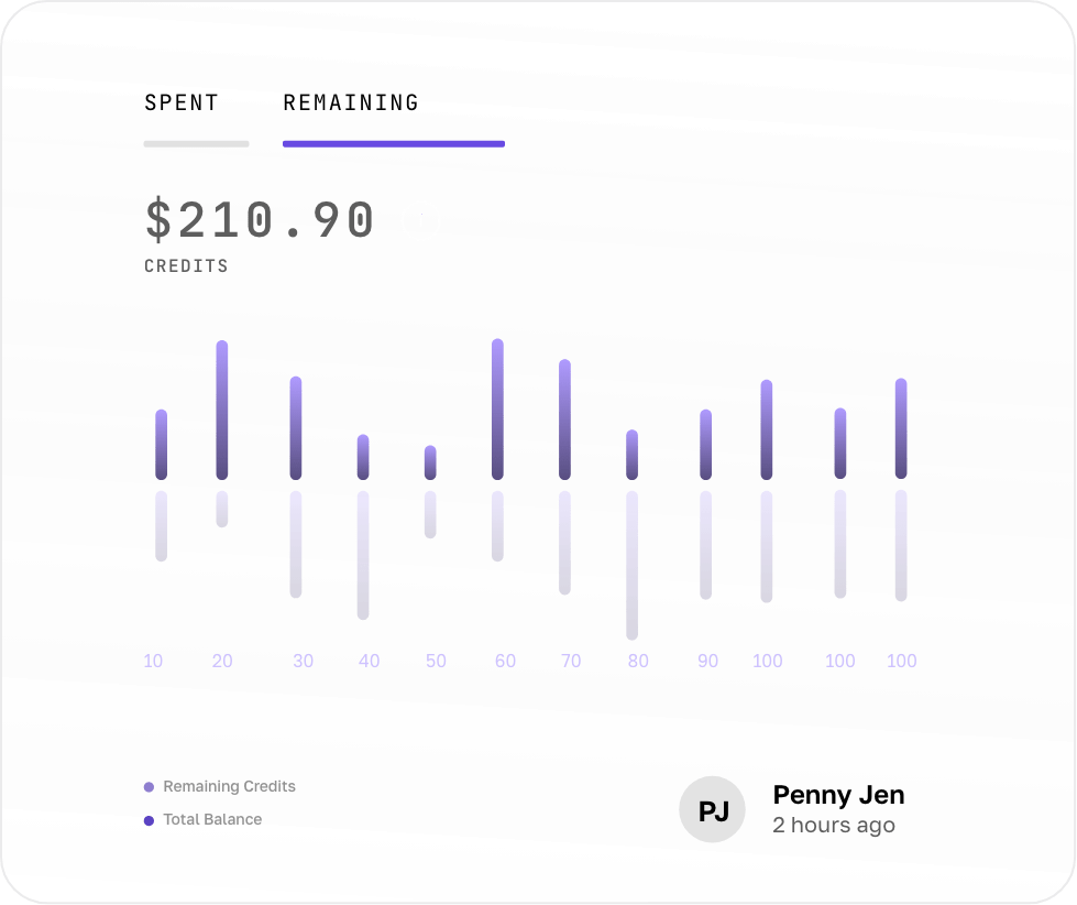
Dashboard
Solution:The Stock Market Sidekick
High-Tech Data Visualization turned the rollercoaster into a stroll in the park. Profit and Loss statements became as clear as a kids' coloring book, with insights neatly colored inside the lines
Segment 1: Shareholder Equity Secrets Revealed: Shareholder equity ceased being a magic act. High-Tech Data Visualization unmasked the tricks, revealing them as straightforward finance equations.
Segment 2: Analyst Predictions Decoded: Analyst predictions turned into treasure maps, and High-Tech Data Visualization was the X marking the spot. It was like having a GPS system for market forecasts.
Segement 3: Peer Analysis Unveiled: Peer analysis stopped being a mystery novel. High-Tech Data Visualization transformed it into a user-friendly guidebook, helping us navigate the world of market competitors.
Data-Driven Decisions & Efficiency:
Data-Driven Decisions
We're no longer guessing; we're sailing smoothly through market waves, all thanks to High-Tech Data Visualization.
Efficiency Elegance
Our operations are as smooth as a waltz on the trading floor. No more financial rollercoaster rides; we're in control.
Insights that Amuse
We're not just crunching numbers; we're making data our favorite stand-up comedian. The High-Tech Data Visualization Stock Market Sidekick is our laughter therapy!
So, there you have it, our journey from financial rollercoasters to smooth sailing. The "High-Tech Data Visualization Stock Market Sidekick" is our secret to success. With it, we're not just riding the waves; we're riding them with style!