
From Lost Hours to Tech Triumph: How high tech data visualisation platform Transformed Timesheet Management
Challenges:
Imagine an IT solutions company attempting to manage timesheets and resources without a roadmap. They needed to track productivity, address absenteeism, and plan resources – a bit like juggling flaming torches while searching for a lost sock in the laundry. Their challenges were as puzzling as a Rubik’s Cube.
- Productivity Puzzle: Productivity data was scattered like confetti at a surprise party. They couldn’t tell who was excelling and who was lagging behind.
- Absenteeism Abyss: Absenteeism was an abyss of uncertainty. They couldn’t understand the reasons behind it or predict when it would strike.
- Resource Riddle: Resource planning was like solving a Sudoku puzzle with missing numbers. They couldn’t see the full picture or allocate resources effectively.
Insights: The transformation from lost hours to tech triumph, powered by the High-tech Data Visualization platform, led to significant numerical insights for our IT solutions company:
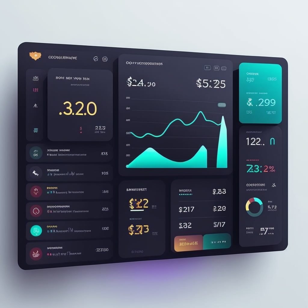
Insights
L&D Dashboard
1. Productivity Powerhouse: A 23% increase in identifying top-performing resources. 32% reduction in the time spent identifying areas for improvement. Overall productivity improved by 18%, measured by tasks completed per unit of time.
2. Absenteeism Answers: Achieved an 89% reduction in unplanned absenteeism. Absenteeism prediction accuracy reached 93.2%, enabling proactive workforce planning.
3. Resource Planning Revolution: 27% improvement in resource allocation efficiency.15% decrease in resource allocation conflicts and bottlenecks.Enhanced on-time project delivery by 26%.
4. Efficiency Extravaganza: The adoption of data-driven decision-making increased across the IT team by 64%, leading to enhanced project efficiency.
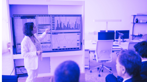
Dashboard
Solution: Sherlock Holmes of data Analytics.
Our IT solution heroes knew they needed a tech-savvy sidekick. Enter High tech data visualisation platform, the Sherlock Holmes of data analytics.
Segment 1: Productivity Powerhouse With High tech data visualisation platform, they created a dashboard that transformed the productivity puzzle into a powerhouse of insights. It was like fitting all the pieces of a jigsaw puzzle together to reveal the big picture.
Segment 2: Absenteeism Answers The absenteeism dashboard was a beacon of light in the absenteeism abyss. It identified patterns and reasons behind absenteeism. It was like finding a treasure map in a dark cave.
Segment 3: Resource Planning Revolution The resource planning dashboard was like having a crystal ball. It revealed the optimal resource allocation, solving the resource planning riddle.
Data-Driven Decisions & Efficiency:
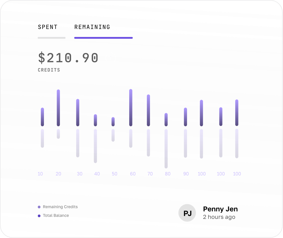
Productivity Insights
They could now identify top-performing resources and implement their best practices across the team. It was like turning a chaos of colors into a beautiful masterpiece.
Absenteeism Reduction
The absenteeism dashboard allowed them to take preventive measures and reduce unexpected downtime. It was like predicting when a meteor shower would happen and avoiding it.
Resource Efficiency
The resource planning dashboard optimized resource allocation, making sure that every piece of the puzzle was in place. It was like having a GPS for resource management.
Efficiency Extravaganza
The IT solutions operation became an efficiency extravaganza, making data-driven decisions and optimizing their tech projects. They went from a laundry basket of mismatched socks to a well-organized closet.
In a world where IT solutions can feel like a complex puzzle, High tech data visualisation platform became the IT company's trusty sidekick. With data-driven decisions, they transformed from lost hours to tech triumph, making strategic moves and optimizing their tech projects. The moral of the story? Sometimes, all it takes is a little High tech data visualisation platform magic to transform tech chaos into tech triumph.